


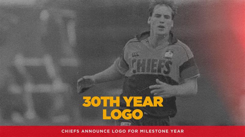
The Chiefs Rugby Club have released a commemorative logo to celebrate 30 years of Chiefs Rugby. The logo has deep meaning for the club and will be embedded across playing and retail kits, designs, signage and more during 2026. Originally designed in 1996, by Dave Clarke Design, the Chiefs logo has been reimagined by long time designer Dave Burke with collaboration from Chiefs cultural advisor Ora Kihi, and previous head coach Clayton McMillan. With new elements that honour the clubs legacy and celebrate the milestone of 30 years the full story can be read below.
“THE 30-YEAR LOGO CELEBRATES OUR LEGACY. EVERY ELEMENT TELLS A STORY, PAYING TRIBUTE TO THE ONES WHO SHAPED US— PAST AND PRESENT. IT’S MORE THAN A SYMBOL WE WEAR; IT’S A TAONGA WE CARRY WITH PRIDE.”
This logo represents our legacy
444 players across both teams. Generations of fans. One unbreakable bond. In 1996, the Chiefs were born into a new era of professional rugby. Thirty years on, our journey has been defined by pride, connection, and an unrelenting spirit that flows through every generation who has worn the jersey.
To celebrate this milestone, this logo honours our past while embracing the future – a symbol of strength, unity, and the whakapapa that binds us all. When we wear this logo, we tell our story. We honour our roots. We fight with the wairua of the river, the heart of the taniwha, and the strength of a chief. This logo is not just about looking back – it’s about carrying our legacy forward into the next chapter.
This logo is our identity
Our logo is more than design – it is a carved legacy. We don’t just display this logo. We embody it. Every line, every element has been intentionally and intricately crafted to honour thirty years of our journey. This logo carries the spirit of those who came before – the players, the people, the victories that shaped who we are.
Carved into this logo’s form are the triumphs of the past, the power of our Rangatira (Chiefs), and the echoes of the great battles that forged our path.
Each detail celebrates the courage, strength, and mana that define this franchise and its people. This logo is our legacy to be displayed with pride. A tribute to the warriors of the past. And a challenge to those who carry this logo now – to rise, to honour, to inspire.
This logo carries whakapapa
Thirty years of legacy – a woven narrative of pride, identity, and power. This logo draws inspiration from the generations that shaped our franchise, telling stories through:
- Haehae lines – sacred pathways of connection
- Niho taniwha – the enduring strength of guardians
- Mauri – the life force flowing through time
- Whakapapa – the genealogy that binds us
Our values are deeply etched into this logo’s design:
- Kaitiakitanga – guadrianship of our legacy
- Kotahitanga – unity across generations
- Whakatōhea – strength in numbers
- Turangawaewae – our place to stand
- Whānaungatanga – family bonds that endure
Together, they represent the battles fought, the mana earned, and the strength shared across three decades. At its heart, this logo stands for continuity, legacy, and the unbreakable spirit that defines the Chiefs.
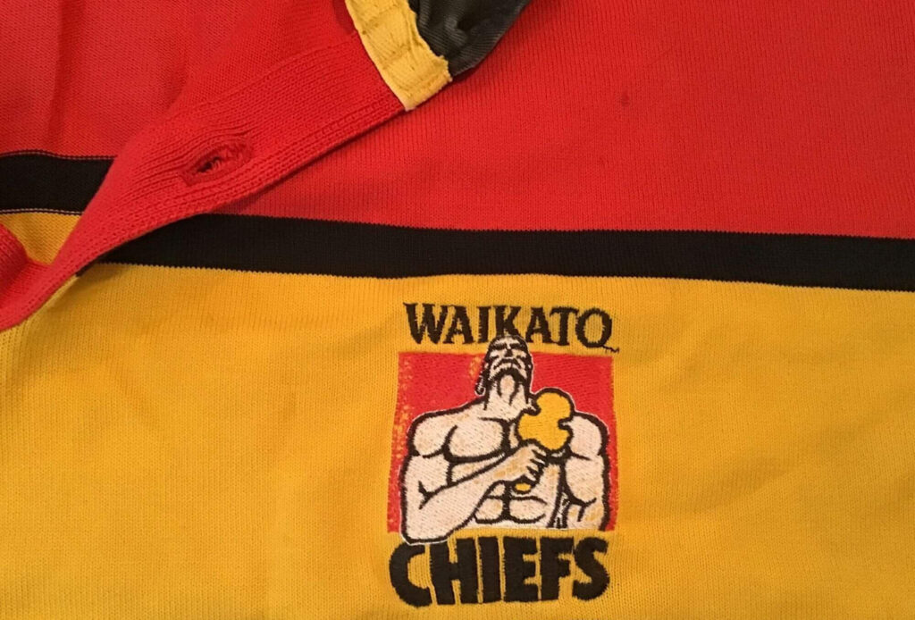
The original Chiefs logo as designed in 1996 by Dave Clark Design. The logo has remained largely unchanged with the removal of ‘Waikato’ being the only significant edit in 30 years
The logo’s design elements
thirty lines of legacy

Haehae lines (sacred grooves)
These sacred grooves embody the interwoven pathways of our whakapapa – connecting 30 seasons of grit, growth, and glory. They channel the mauri (life force) flowing from our past to our future. This logo’s haehae lines speak of connection across time. They represent the threads that bind every player who has worn the jersey, every fan who has stood with us, every moment that has defined our journey. These lines are not just decorative – they are the arteries through which our whakapapa flows. Each groove carries the essence of our story: the struggles that strengthened us, the victories that lifted us, the bonds that sustained us. This logo honours the pathway that brought us here and the pathway that leads us forward.
The 30 outer lines each represent a year in the journey of our whānau – a testament to resilience, brotherhood, and the soil we stand for. This logo doesn’t just count years; it honours them. Every line in this logo represents a season of growth, a chapter of our story, a year of players who gave everything, of fans who never wavered, of moments that became legend. This logo reminds us that legacy isn’t built in a day—it’s carved line-by-line, year-by-year, through dedication and heart. Each of these thirty lines carries the weight of history and the promise of what’s to come.

niho taniwha (guardian’s strength)
The teeth and claws honour the enduring strength of Waikato Taniwharau. This logo embodies the power of the taniwha – the guardian spirit that has watched over our journey for thirty years. The niho taniwha in this logo represent more than symbols, they are reminders of the fire in our belly, the beast within that drives us forward. They speak of protection – the way our whānau protects each other, the way our legacy protects our future. The logo carries the essence of the taniwha that rises when called upon: the protector that emerges in battle, the guardian that never sleeps. This is the strength that has sustained us through three decades.
Stars of Triumph

Blazing tributes to championship triumphs earned on sacred turf, with space left for legends yet to rise. This logo celebrates our victories while acknowledging our hunger for more. These stars in this logo burn bright with the memory of glory. They remind us of the moments when everything came together, when the team became more than the sum of its parts, when the Chiefs stood as champions. But this logo also speaks of ambition, of dreams yet to be realized, of stars yet to be earned. This is not just about what we’ve achieved – t’s about what we’re still reaching for.
Dawn of Light (The Yellow)
The yellow in this logo represents the dawn of light – anchored in 1996, this golden sunrise resurrects our first dawn, the spark that ignited thirty years of legacy. This logo’s yellow foundation carries the energy of our beginning, the light of our birth. The yellow dawn of light in this logo is more than colour – it’s the sunrise that marked our emergence, the golden moment when the Chiefs first took the field and forever changed the landscape, the yellow light that has guided us through every season since, burning bright through triumph and challenge. This logo’s yellow dawn reminds us where we came from. It honours the vision that started it all, the belief that something special could be built from the first light of day, the faith that brought us to this moment, thirty years strong and still rising with the sun.
Celebrate with the team
30 years of loyal fans supporting the teams as they battle on field, means you can continue the legacy by taking a seat in history. With more 30th year celebrations on the way you’d don’t want to miss out. Read more about memberships here or use the button below to buy yours today.
If you would like access to any Chiefs Rugby Club, Gallagher Chiefs or Chiefs Manawa branding or assets, please contact [email protected] directly